Dhrumil Kumar is an accomplished architect with a Bachelor’s degree in Architecture from CSIIT and a Master’s degree in Urban Planning from CEPT University. He began his career in architecture in 2012 and he is the founder and Principal Architect of Alankaar Studios.
The firm has a pan-India presence and specializes in residential and commercial projects. They have also pitched in government projects such as the Chhattisgarh High Court, Warangal Urban Planning, Warangal Mayor’s
office, and Dhirubhai Ambani Home for All.
He was trained under his grandfather and renowned architect and pioneer of modernist and brutalist architecture in India Sri B.V. Doshi, and places great importance on dimensions and proportions in his designs.
Dhrumil is a contemporary and modern architect who believes in the philosophy of “true to material”. He advocates for the honest representation of materials in their true form and not disguised in any way.
About the Project:
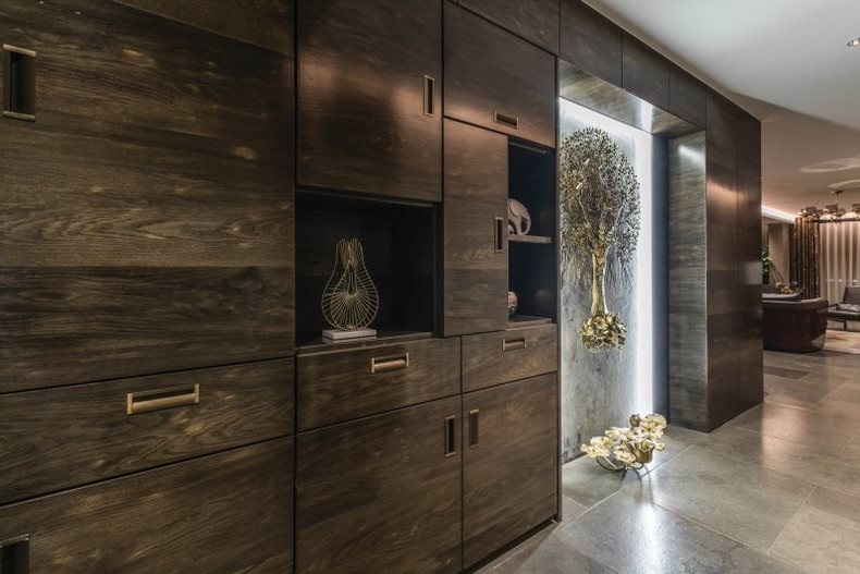
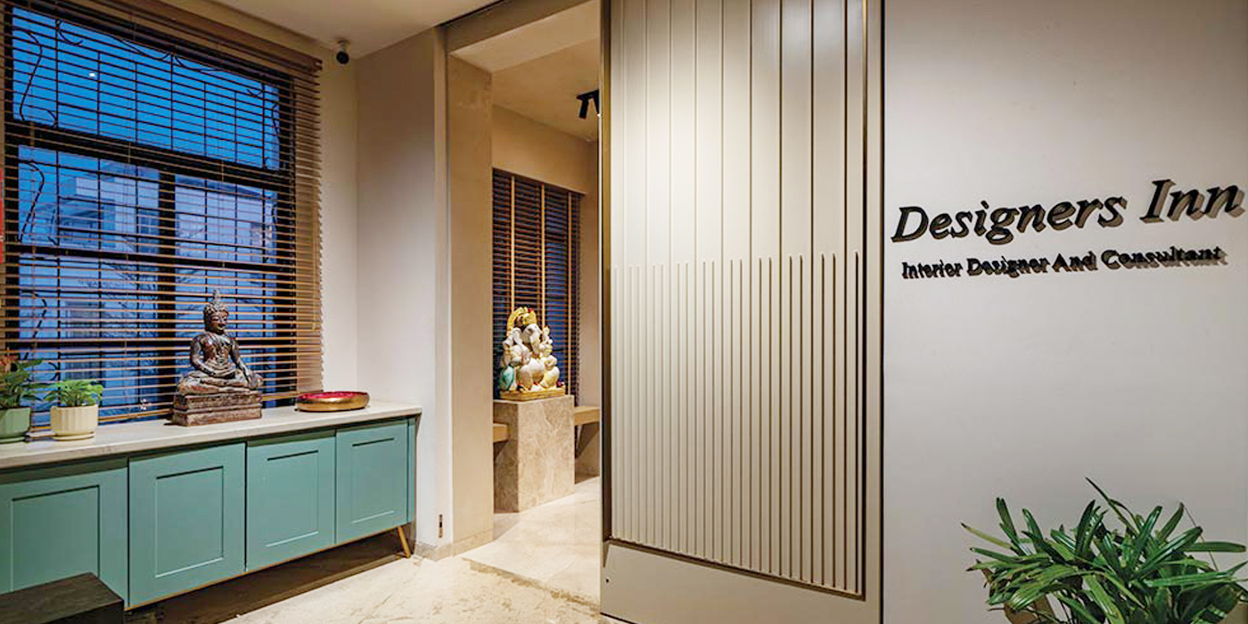
The office space of Alankaar Studios seamlessly blends natural elements and a fitting colour scheme while adhering to Vastu principles. The planning of the skylight takes proper north light into consideration. Skylight areas and windows are positioned thoughtfully to ensure abundant sunlight and natural air circulation, resulting in well-ventilated and naturally cool spaces. The spaces remain well-lit until sunset, eliminating the need to turn on lights. The colour scheme is inspired by the earth’s elements, with green dominating the eastern side, blue tones prominent in the north, reddish tones in the south and southeast, and yellowish tones in the southwest to west. A subtle grey is employed to accentuate primary colours, and orange is the dominant colour scheme. The Le Corbusier Modulor system is utilized for a balanced and harmonious space. The design’s attention to detail blends elegance and functionality seamlessly. By meticulously using his strengths in Mahavastu, dimensions, and proportions, and applying these fundamental principles of design, Dhrumil has created an office space that truly stands out.

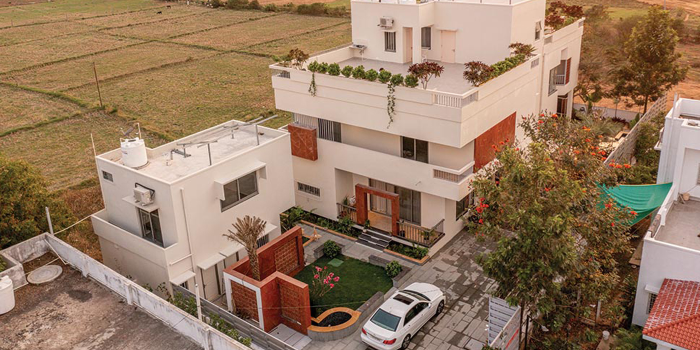
The primary concept driving the elevation and structure’s design was to incorporate as much natural light as possible to minimize electricity usage and promote Sustainability. The architect was able to take advantage of the North and East-facing aspects of the building to create a visually striking balcony design. The exterior window fins were strategically angled to diffuse and direct the wind towards the windows. The choice of colour palette, specifically yellow, green, and red, was deliberate and purposeful.


